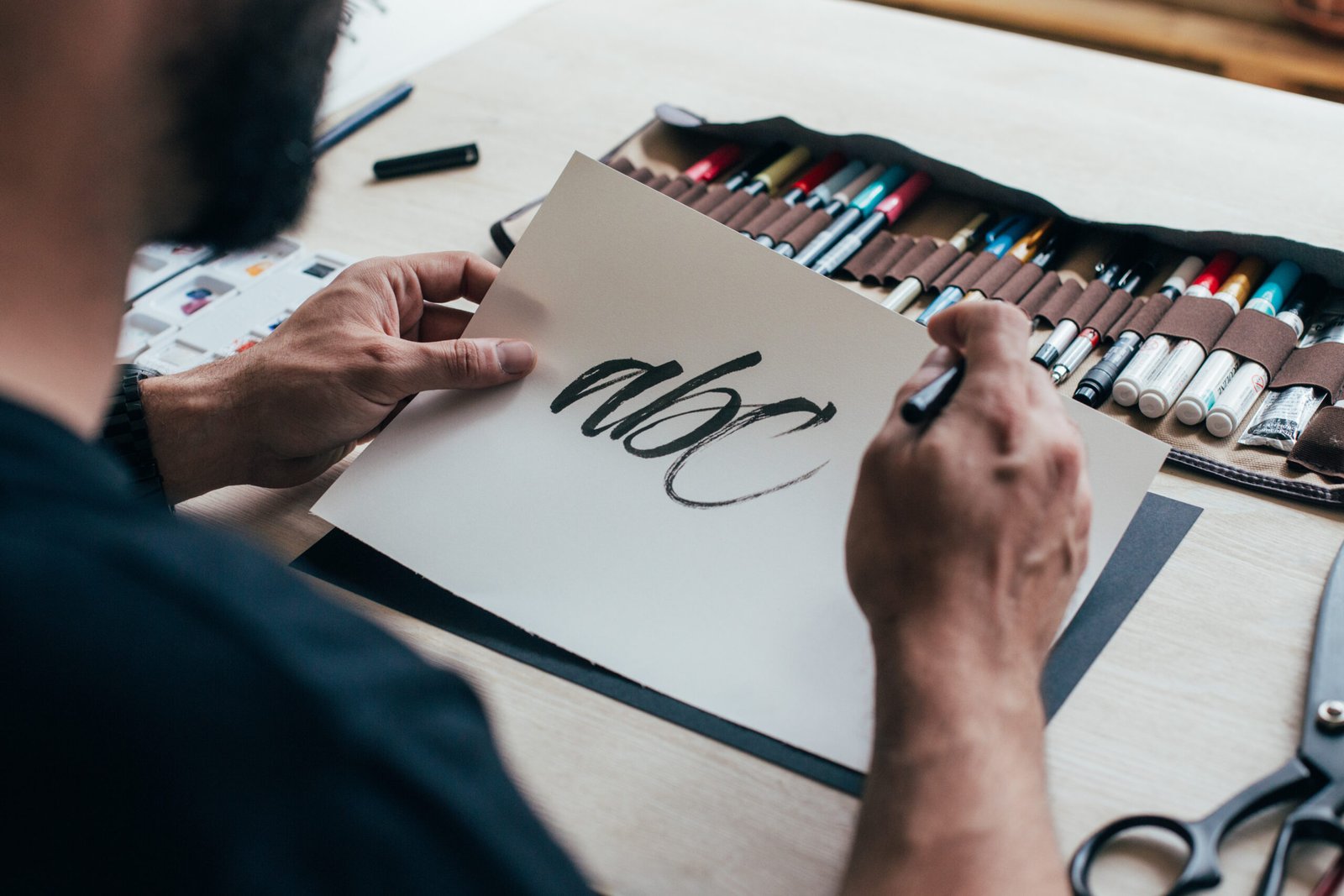
Typography is more than just selecting a font; it’s a critical aspect of design that influences how your audience perceives and interacts with your content. The right typeface can elevate your project, making it more engaging, readable, and aligned with your message. On the flip side, poor font choices can confuse your audience or undermine your work’s professionalism. In this blog post, we’ll dive into the importance of typography and share practical tips to help you choose the perfect fonts for your project.
1. Understand Your Project’s Purpose and Audience
Every design has a purpose, and your typography should align with it. Ask yourself:
- What message am I trying to convey?
- Who is my audience?
For example, a sleek, sans-serif font might work well for a tech startup, while a decorative serif font could add sophistication to a wedding invitation. Understanding your project’s context is the foundation of good typography.
2. Balance Style and Readability
While it’s tempting to choose an ornate or trendy font, readability should always come first. Fancy fonts may look great in headlines or logos but can be hard to read in body text. For lengthy text, stick to clean, legible fonts like Times New Roman, Helvetica, or Georgia. Pair these with bolder or more stylized fonts for headlines to create visual interest without sacrificing clarity.
3. Learn the Art of Font Pairing
Combining two or more fonts in a project can add depth and hierarchy, but it’s important to do so thoughtfully. Here are some tips for effective font pairing:
- Contrast is Key: Pair a serif font with a sans-serif font for balance and contrast.
- Limit Your Choices: Stick to two or three fonts per project to avoid a cluttered design.
- Match the Mood: Ensure that all chosen fonts align with the tone of your project. For instance, a playful script font might clash with a formal serif font.
Tools like Fontpair and Google Fonts offer excellent inspiration for pairing combinations.
4. Consider the Medium
Typography should adapt to the platform where it will be displayed. Fonts that look stunning in print might not translate well to digital screens. For web projects, prioritize web-safe fonts like Arial, Roboto, or Open Sans. These fonts are optimized for digital use and ensure consistency across devices and browsers.
5. Use Hierarchy to Guide the Eye
Typography is a powerful tool for establishing visual hierarchy. Larger, bolder fonts naturally draw attention, making them ideal for headlines. Subheadings should be smaller but still stand out, while body text should be smaller and easy to read. Using hierarchy effectively helps your audience navigate content effortlessly.
6. Test Your Fonts in Context
Always test your chosen fonts in the actual context of your design. A font that looks amazing in isolation might not work as well when paired with images, colors, or other design elements. Experiment with font size, weight, and spacing to ensure everything flows seamlessly.
7. Be Mindful of Licensing
Before using a font in your project, check its licensing terms. Many fonts are free for personal use but require a commercial license for professional projects. Websites like Google Fonts offer a wide selection of free, open-source fonts, making them a safe choice for various projects.
Typography is more than just a design element—it’s a storytelling tool that can shape how your message is perceived. By understanding your audience, balancing style and readability, and carefully selecting and pairing fonts, you can create designs that are not only visually appealing but also effective in communication. Remember, great typography doesn’t draw attention to itself; it enhances the message it supports. So, choose your fonts wisely, and let your design speak volumes.


Leave a Reply